Trello Timeline vs Planyway Timeline
July 19, 2021 · 7 min read
We took a moment and explored this very promising update. So, we’re about to share our insights and compare Trello’s and Planyway’s timelines to see the pros and cons of both.
1. Timeline View
From first sight, these timelines seem similar with cards scheduled depending on their start and end dates. Both of them provide a timeline split by team members, labels, and lists which let you track work on the timeline view much easier. But let’s dig a little deeper and see their differences:
Checklists
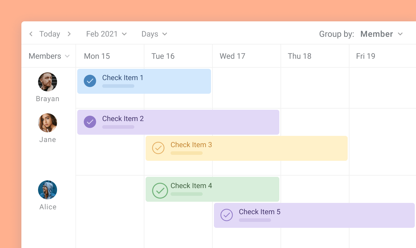
All Trello users know that subtasks are created through checklists. As long as you don’t use them, the Trello timeline view is gonna work well. But once you ask yourself if it’s possible to visualize them along with your tasks - the answer is no. The only way to see smaller steps is inside cards.
Planyway’s approach is different. It treats check-list items with the same respect as regular cards and lets you visualize them as well. One more benefit is that Planyway allows you to set check-list items as multiple-day cards.
Labels
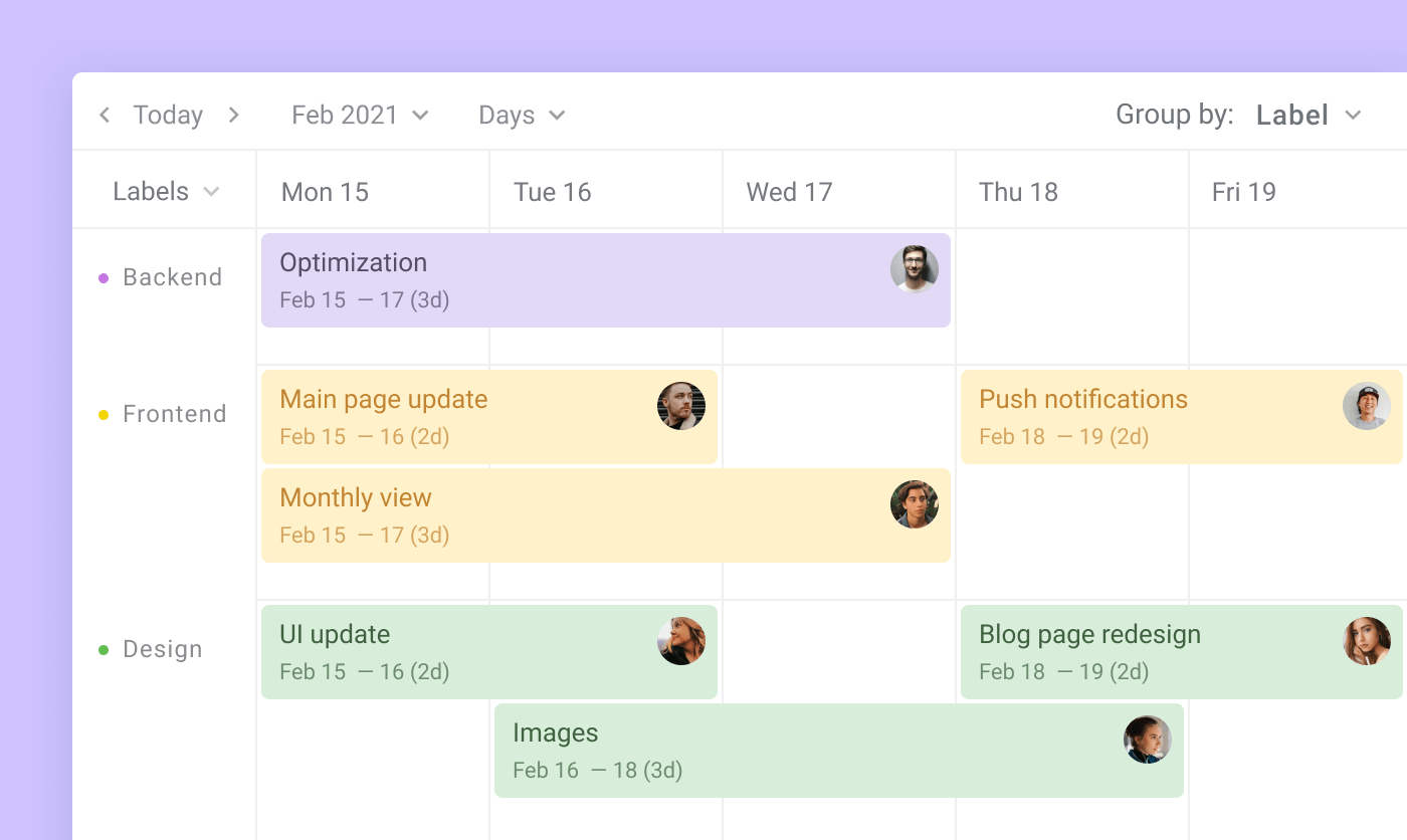
Labels are a really useful feature when you’re looking for a way to track types of activities, statuses, or prioritize tasks. Both timelines make it possible to see tasks by label lanes, so the workflow can be tracked by labels. Yet it might work well enough, Planyway has a trick up its sleeve. All cards have a background color that matches the color of labels, so you always can keep track of them no matter what view you work in.
Cards from other boards
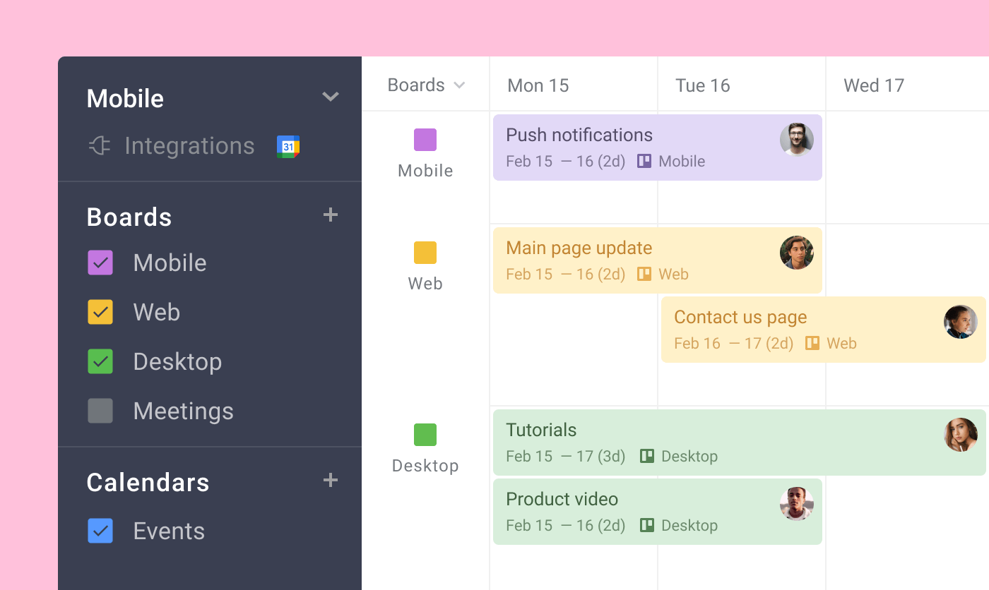
When managing multiple projects it’s so time-consuming to switch tabs from one to another. On Planyway you can add any board to the current one and see them together on one page which is extremely important when managing people’s workload. For a more clear project overview, choose Board lane view and see each board in a separate lane.
Filters
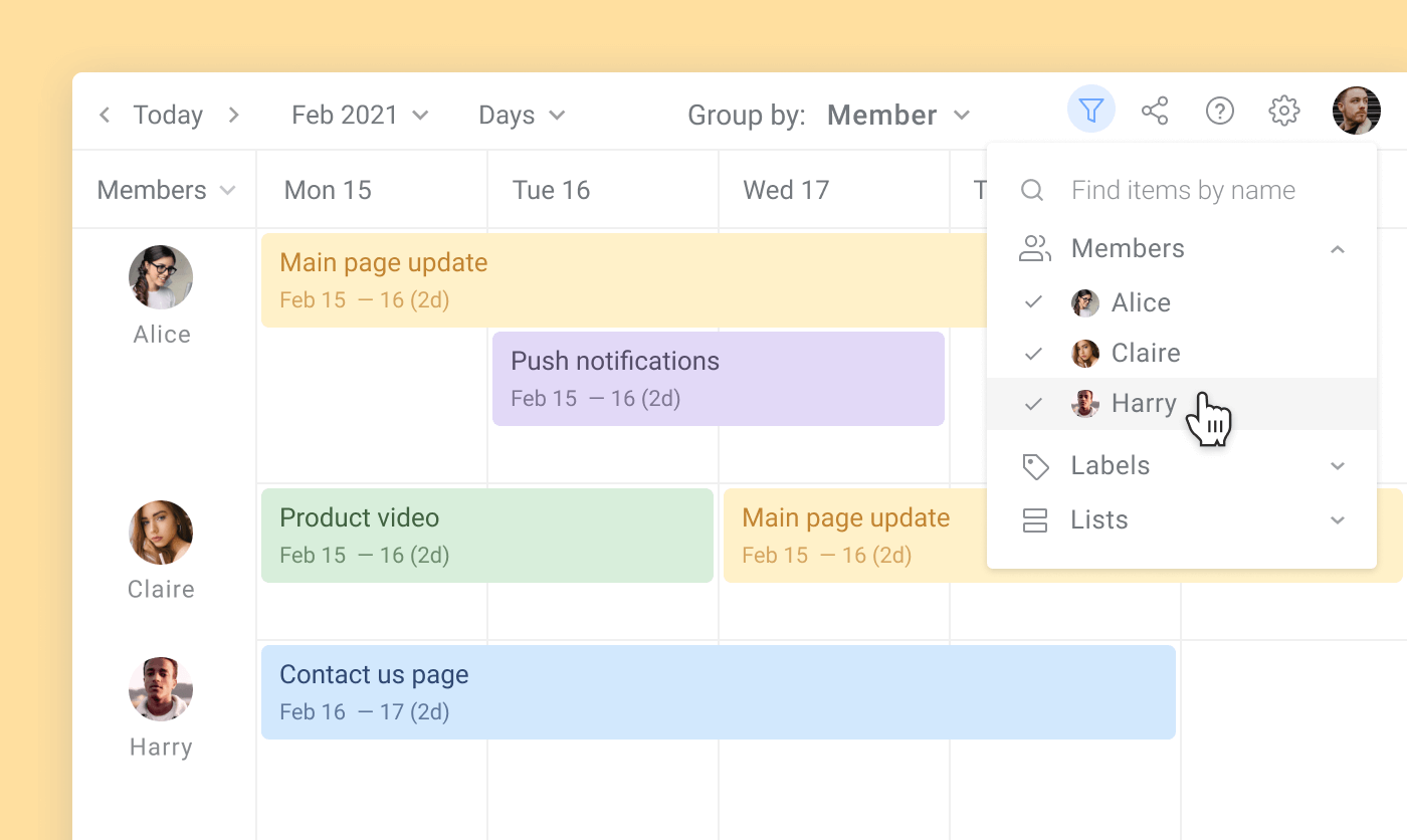
On the Trello timeline, you see all cards together which might become very overwhelming. Planyway adds filters to see only the cards you need. Cards can be filtered by members, lists, or labels.
Completed cards
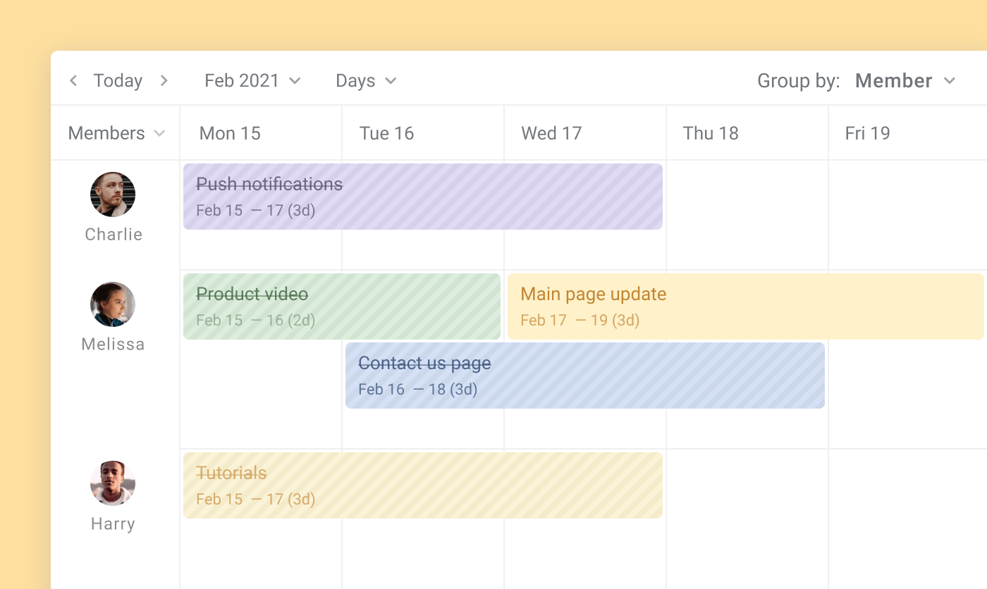
The only way for completing cards on Trello is to do it in a Trello card. And the problem is that it won’t be visible on the timeline. On Planyway no matter what view is used, you can complete cards straight away and have completed cards crossed, so you’re always aware of what is done. Another useful option - you can choose whether you want to see completed cards or not in the View Settings.to move them onto the Done list on your board. As a result, you can see completed cards only in List lanes. On Planyway no matter what view is used, you can complete cards, then choose whether you want to see completed cards or not.
Trello Archived cards
Trello view doesn’t show archived cards, while on Planyway you can choose to see them along with completed cards or not.
Weekends
Most people don’t work at weekends, so it’s nice to have the option to switch them off which is possible on Planyway.
Lanes
The biggest problem of Trello lanes - they are fixed. This means you can’t reorder them, and which is worse - can’t hide ones you don’t need for now. So, if there are people on your board who are just observers or there are lists you don’t want to see - they are visualized anyway. On Planyway it’s all customizable including the unassigned lane which is always at the bottom on Trello.
Usability
Cards can not be dragged on Trello’s timeline, so the only way for reassigning or rescheduling cards is through the card’s editor. Also, you can’t reorder cards to prioritize what should be done first.
2. Board
The biggest challenge in Trello’s calendar or timeline is that it just overlays boards as a pop-up window. You can’t work with both and should constantly switch from one to another. Moreover, if on Planyway it’s possible to create cards right on the timeline or simply drag cards from the board to assign and schedule, on Trello you need to close the timeline, get back to the board, create a card, then open your timeline again. Sounds like it takes a lot of time…
3. Mobile app
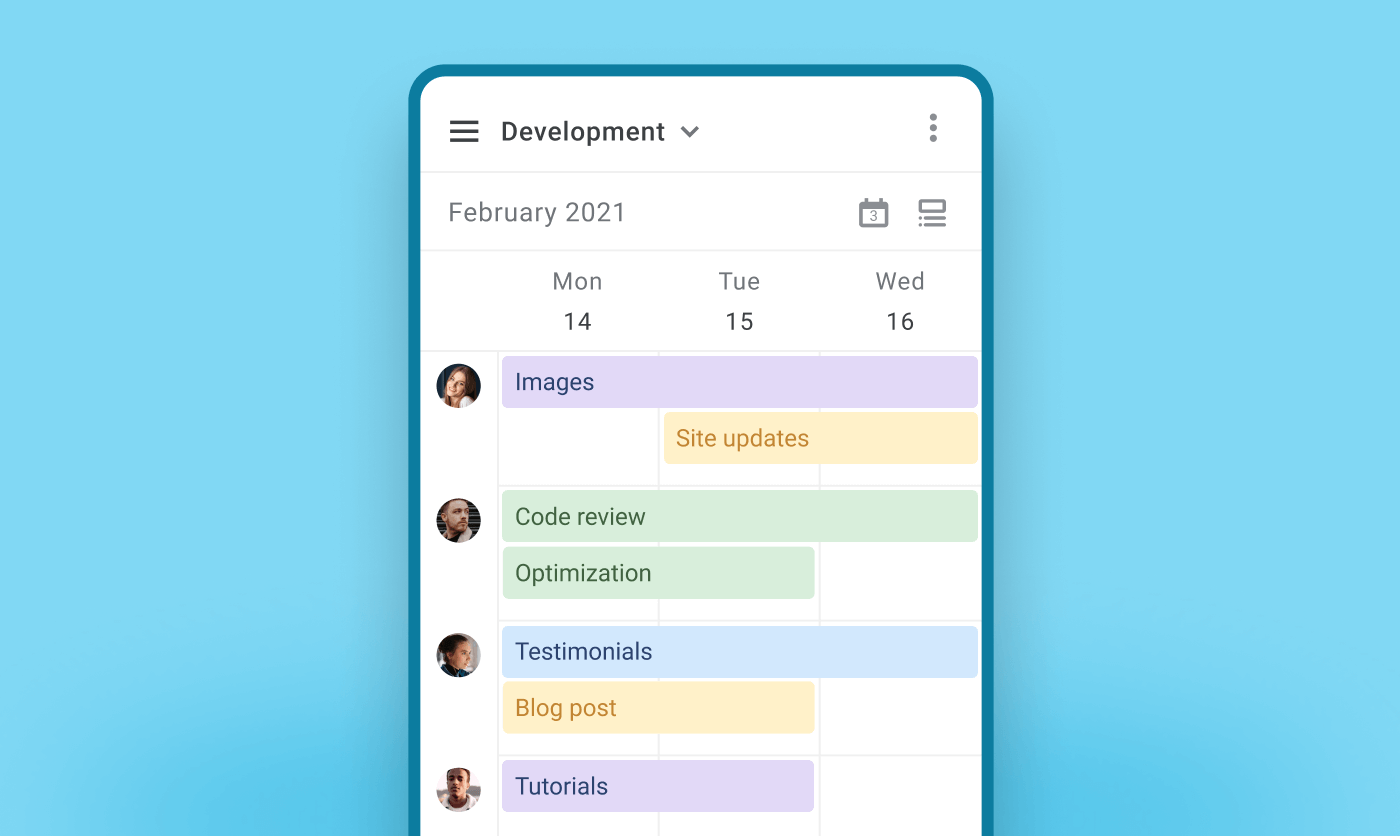
No doubt, it’s great to have a chance to access your timeline away from the desk. So, we’re happy to let you know that both timelines can be reached through your mobile phone. But while Trello’s timeline is available for iOS and Android, the Planyway timeline is available only for iPhone and iPad owners for now.
4. Extra Planyway goodies
Milestones
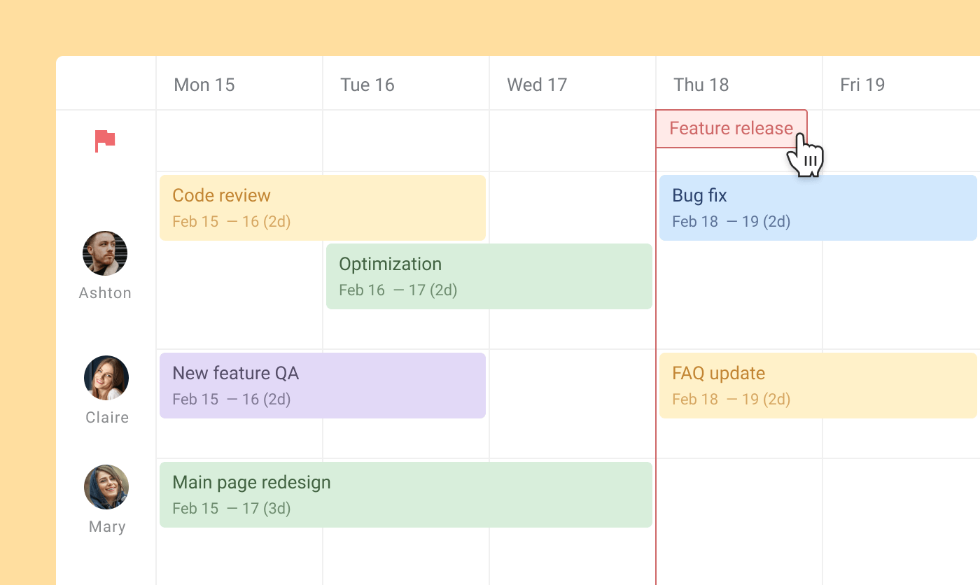
Any project manager knows that milestones are important. We need to see when important deadlines are coming. That’s the reason why we added milestones on Planyway.
Dependencies
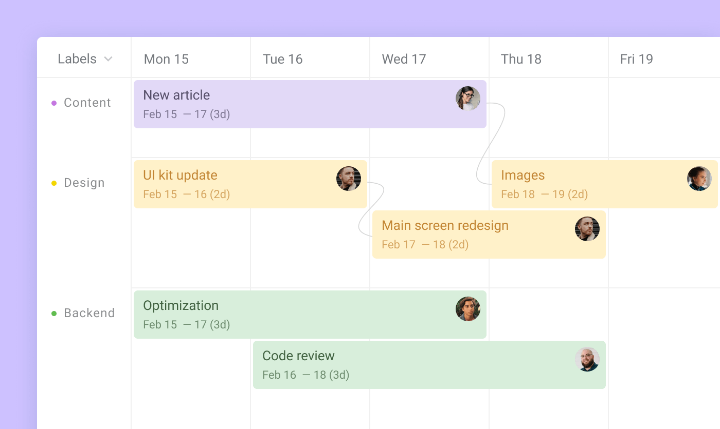
Dependencies are really useful when for high-level planning, as it’s important to see when one task can’t be done without another.
5. Pricing
Planyway pricing is half less than Trello’s Business plan ($5 against $10). What’s more, in Planyway you can buy paid subscriptions only for people who need extra paid features, others can use the free plan or just a Trello board and see all changes anyway. Whereas on Trello you have to buy a paid plan for all your Trello team. The disadvantage is also that if you manage several teams, you need to buy a new subscription for yourself several times which is quite costly. In Planyway roadmap only one is required no matter how many teams you work with.
Conclusion
The best way to understand which app works better for your needs is of course to start a free trial. Both Planyway and Trello provide free 14-day trials. But I guess the difference sticks out a mile as, besides some advanced functionality, the Planyway project timeline for Trello is much more flexible, customizable, and user-friendly. Anyway, it’s a great new start for Trello and we’re sure that lots of cool improvements for this new timeline feature are coming soon.


